THE CHALLENGE
How can a farmer manage his plantations through a single application?
Syngenta is one of the largest agricultural companies in the world, present in 180 countries. The challenge of the project is to create a producer-oriented application that combines digital agriculture, advanced planting tools and the commercial management of Syngenta's orders, marketing and loyalty programs in Europe, Africa and the Middle East.
METODOLOGY
Product design steps
Discovery
First step to understand the product and its problem and the needs of research and interviews
Ideation
After understanding the product, it's time to map the flows and turn the ideas into solutions
Prototype
Once the flows are mapped, we can design the wireframes for validation and then the final prototypes
Testing
With the prototypes done, we can start the tests for refinements and then handoff to Devs
Discovery
Analyze what we have and listen to the user
The first step was to understand what were the main difficulties of users to access the tools of climate, monitoring and management of the farms. I conducted a series of interviews with Syngenta's internal teams in the countries of Europe and the Middle East, as well as users of weather software to understand what motivates them to use it and also what they would like to be different to optimize day-to-day work.
From this survey we identified what would be the objectives of the App, among them, to serve as a bridge of relationship between Syngenta Global and small producers.


What we found out
I interviewed several people involved in the day-to-day management of crops in the EAME region, including users, team leaders and commercial representatives. The critical point raised by the majority concerned the difficulty of finding Syngenta's various products, services and software in one place.
I also asked what were the features most used by users, which returned a list of agronomic tools, such as the Spray radar that indicates the best time to irrigate the plantation and the climate software that accurately show meteorological data such as temperature, humidity, precipitation, wind, among others.
In alignment with the stakeholders we understood what should be the main features of the App and therefore we defined the scope of everything we could have in our MVP.
IDEATION
How should it work?

Benchmarck and data
The first step of the ideation was to understand how the reports and planting recommendations helped the farmer and strengthened the relationship between Syngenta and its small producers. Then, I carried out a benchmark with the main giant competitors of world agriculture, mapping the functionalities of their applications in search of references for the construction of ours.
What can't be missing
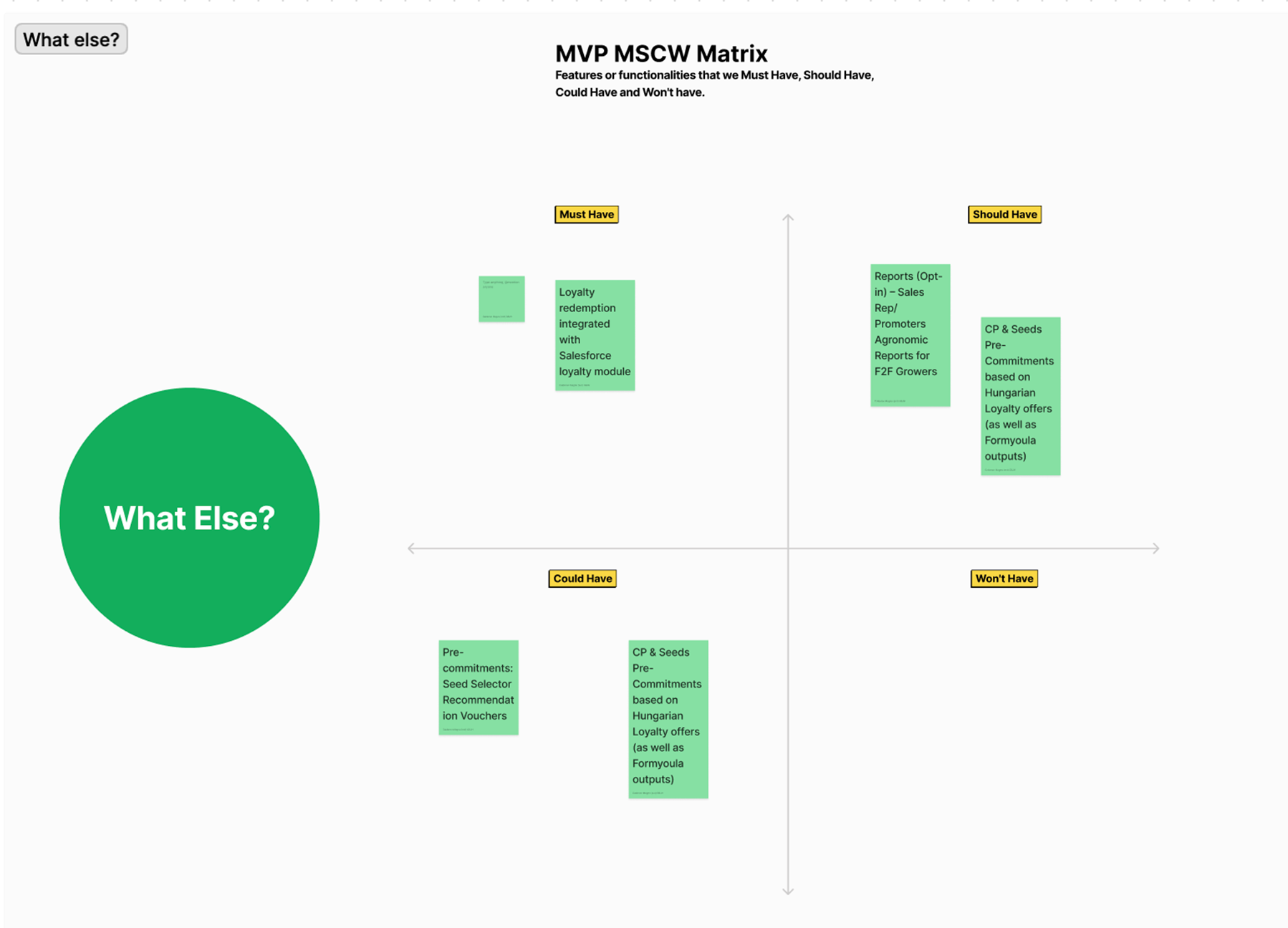
With the main features mapped and references of how we could create them, the time has come to define what the priorities of our MVP were. I conducted a workshop with everyone involved using the MoSCW* matrix, to identify which things we needed to have obligatorily, which ones we should have, which ones we could have in a second moment and which ones we would not be able to build now.
This dynamic, in addition to strongly assisting prioritization, also helped build our backlog with the features that should be built after the release of the MVP.
PROTOTYPES
Bringing form and content
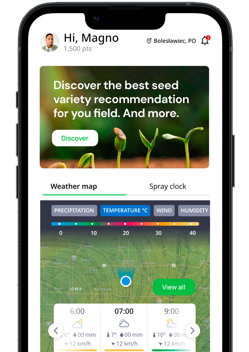
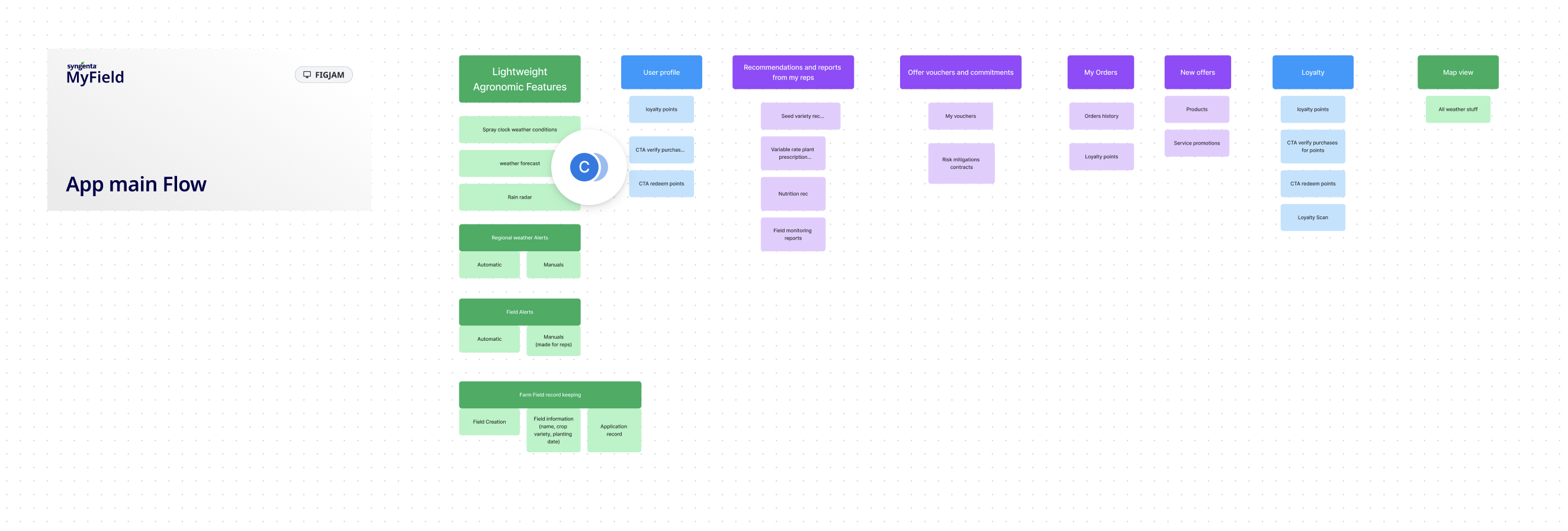
The first step of the prototyping phase was to organize the user's journey and establish the flows from the App's home. The initial suggestion thinking about usability was to bring a map area with the climate tools that was simple for the farmer to find everything in one place, taking into account our user interview insights.
After understanding the new flow I designed some wireframes for approval with stakeholders involved and then went on to the high prototypes.
Prototypes
Mapview e Insights
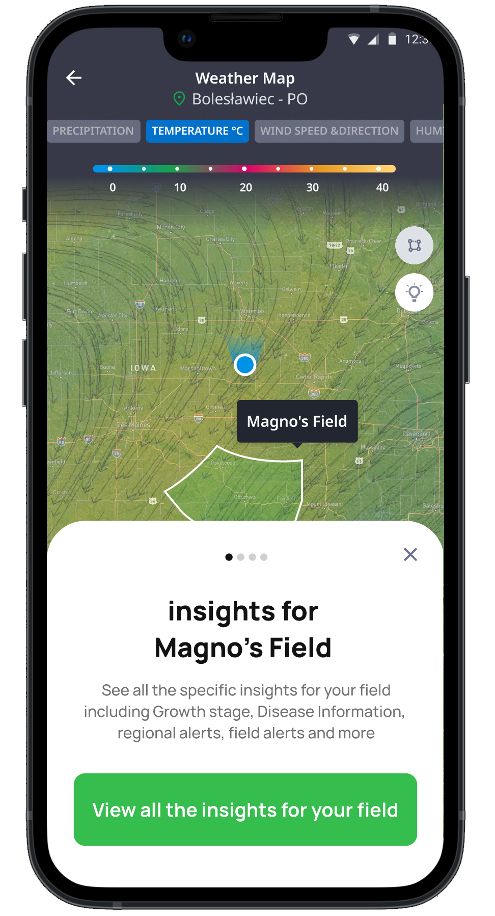
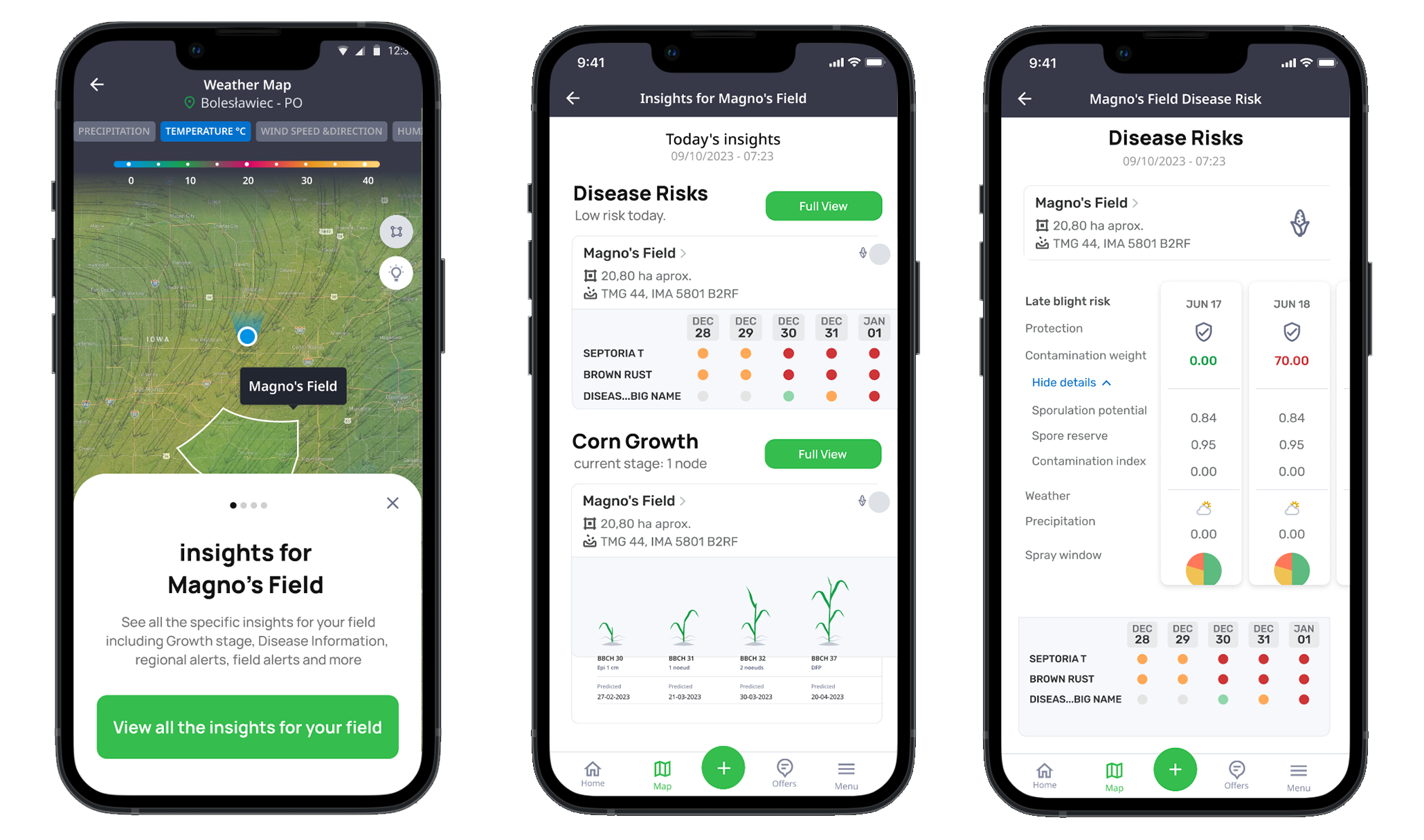
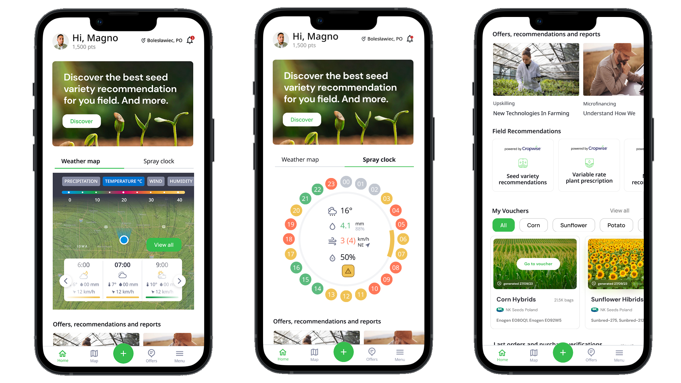
One of the main features of the application is therefore the map with the weather data and meteorological information that delivers to the farmer advanced data of the specific weather conditions of his region.
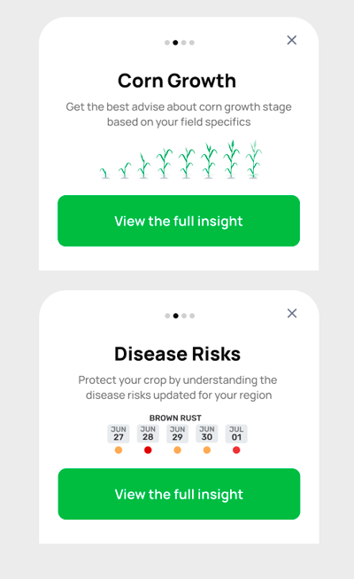
A differential that we build is the part of insights, where the user receives data on crop growth based on what he is planting and the risk of diseases.
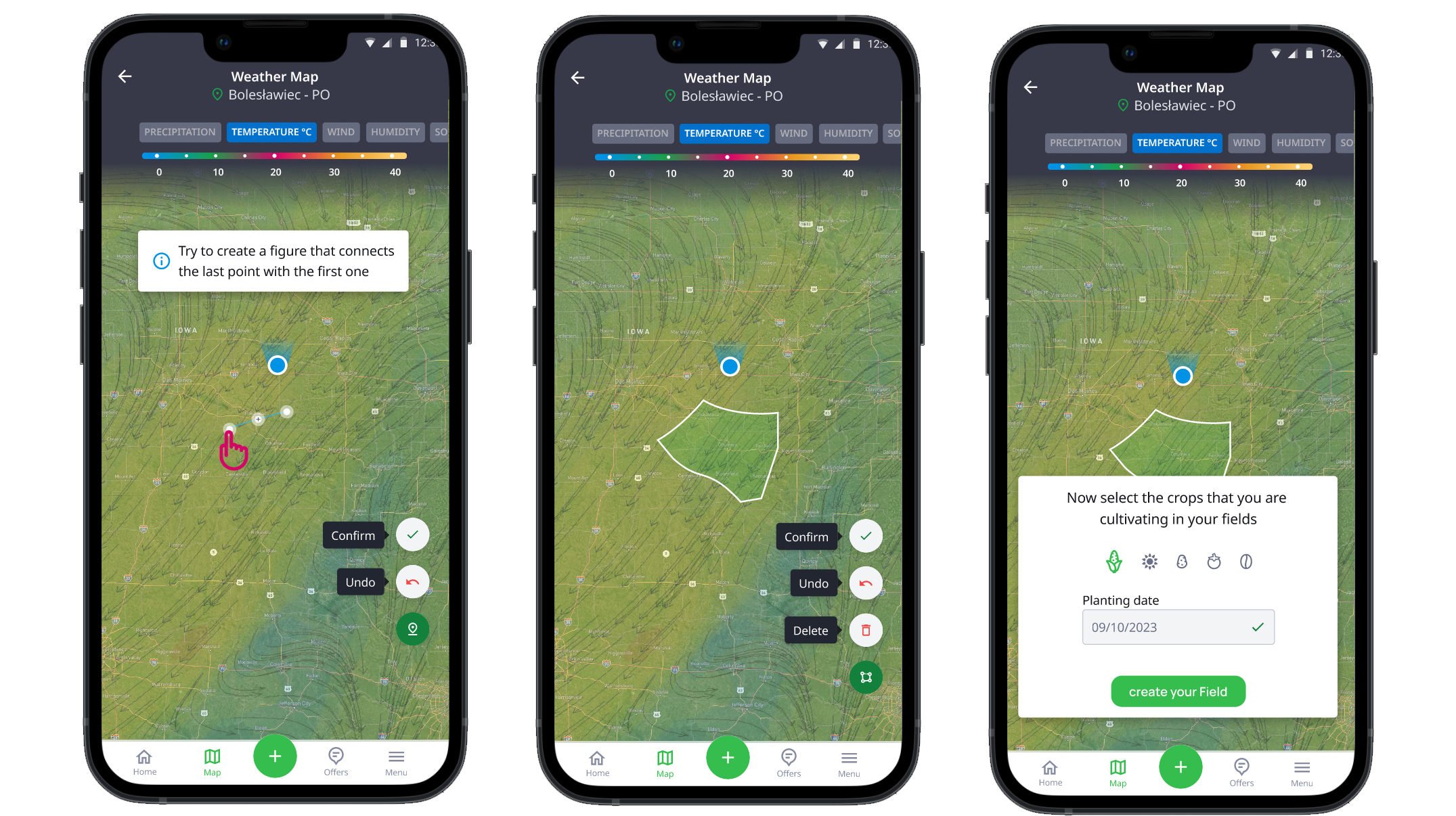
To facilitate access, I built a tab system at the top where the user can easily select which climate view he wants to see on the map. We also brought the possibility of drawing on the map of the exact location of the farm, to receive more accurate insights based on geolocation.
Prototypes
Recommendations and management of plantations
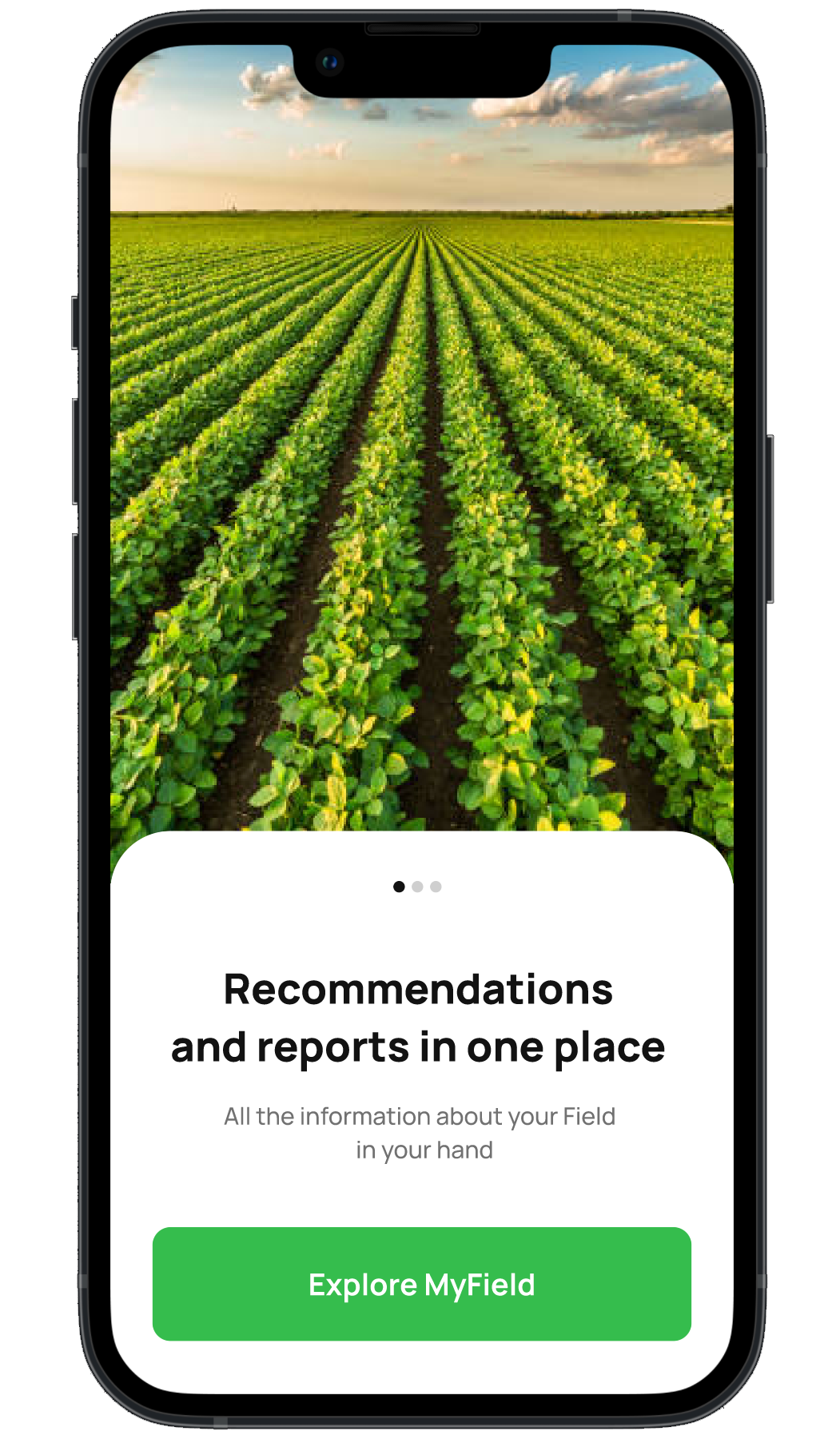
Other strengths of the App are the recommendations part, where we deliver offers, advanced surveying reports and Syngenta's partnership programs with farmers, the Spray radar that engages the user to open the app to check the best times for irrigation and the voucher system for seeds and crop protection products.

Usability tests and metrics
Effective clicks and ease to find information
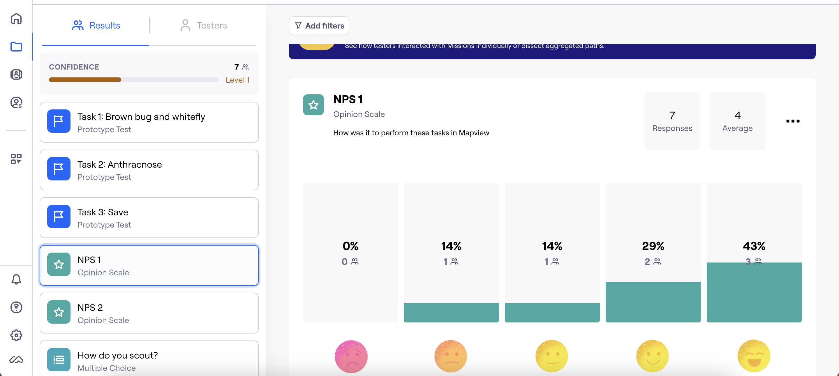
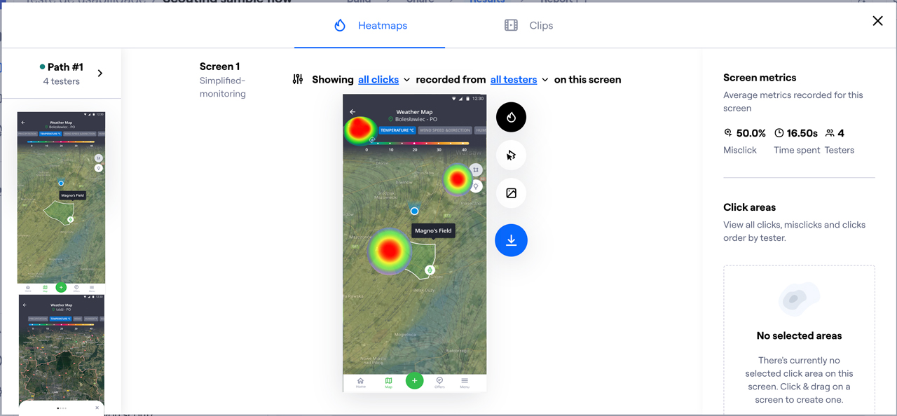
Before the implementation of the developers, usability tests were carried out with the navigable prototypes through the Maze. Defined user navigation missions within the map view and insights to collect information about time and effective clicks.
I also ran an NPS survey to measure users' perception of some areas of the App.

MY CHALLENGES
Organize and execute
As a Product Designer Specialist, I work in this project as the reference of Design within my squad, leading both the discovery and the creation of the UI and prototypes and components.
Beyond the UI/UX, I also collaborate directly on product strategy, in defining the delivery roadmap with the Product Managers (PMs), and especially in close partnership with the development team to ensure a more efficient implementation and development of the App with a international team.

