Fast Shop E-commerce
case study
The challenge
Improve the user journeys and reduce the bounce rate
Fast shop is a Brazilian retail company focused on electronics. Therefore, the objective of your commerce both in the web version and in the mobile versions is to convey credibility and offer an easy and effective shopping experience.
To achieve these goals, my work focused on two aspects. Improving the home page and product pages, also optimizing the flow of the user's journey, with a focus on performance.
Design process
Stages of product development
Immersion
Who is going to use it and how does it work?
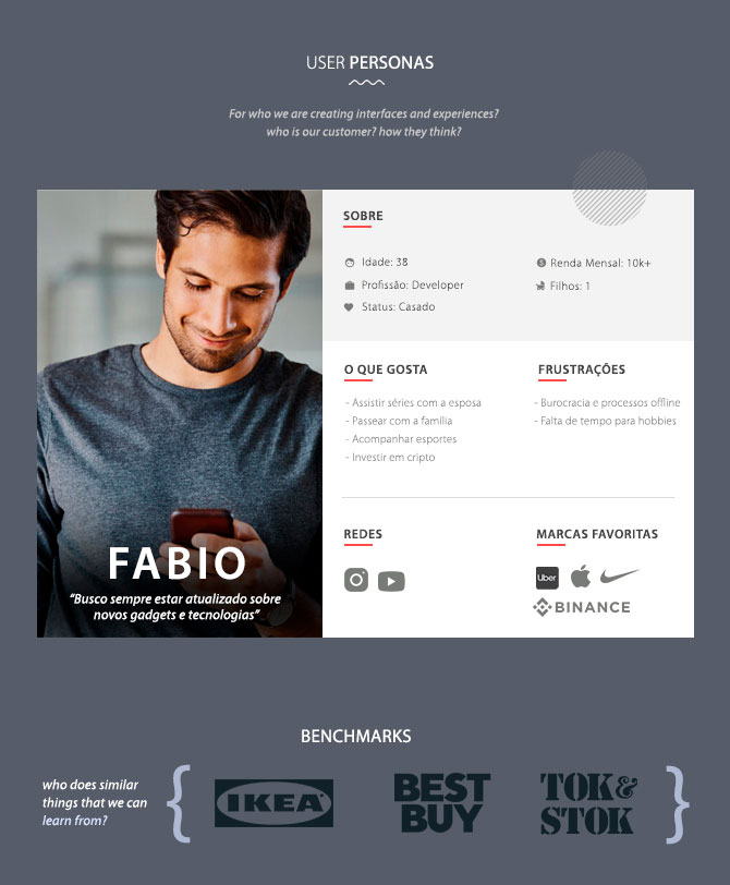
To format the product it is important to understand who the users are and what are the benchmarks that can be references for the functionalities.
Co-creation workshop sessions were held with stakeholders to identify personas and benchmarks and define what functionalities could be improved.
Improving the performance
optimize the user journeys
Discovery
What things we can improve. And How?
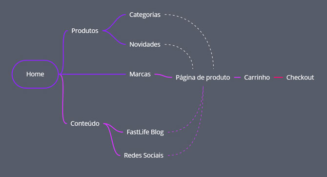
I facilitated workshops with product and sales stakeholders to understand what were the main pains of the current version to discover where design could be a differentiator for performance. At this stage, we defined that home improvements and a more informative product page that kept the user on the purchase journey within the app could contribute to the performance of the APP.

Wireframes
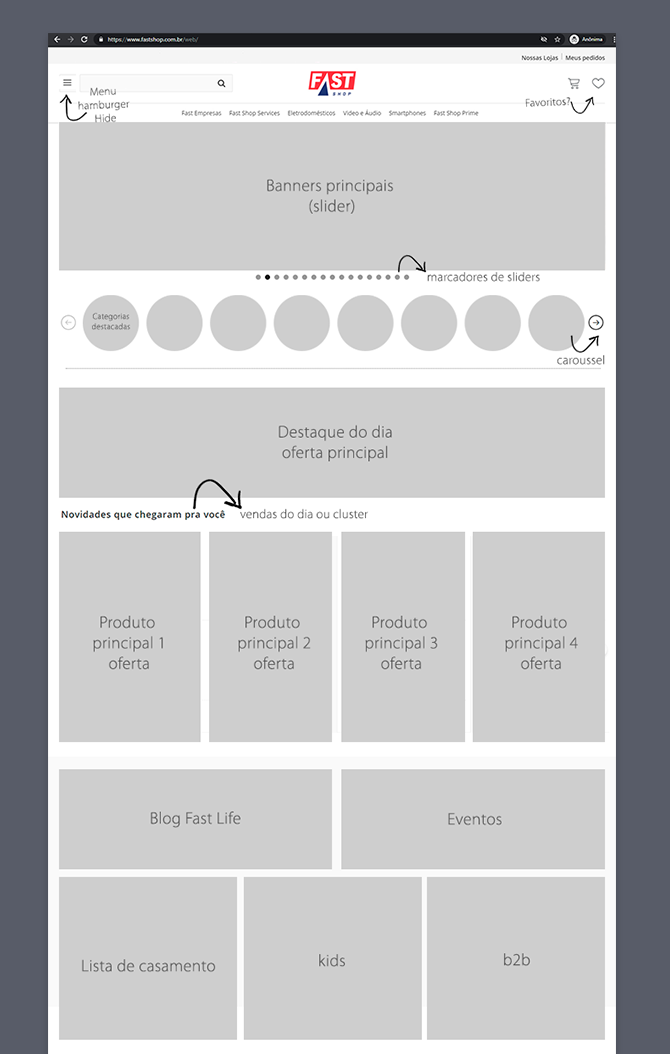
How it should look like (web version)
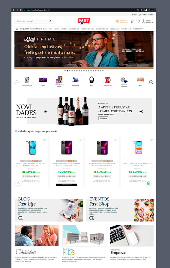
Prototypes
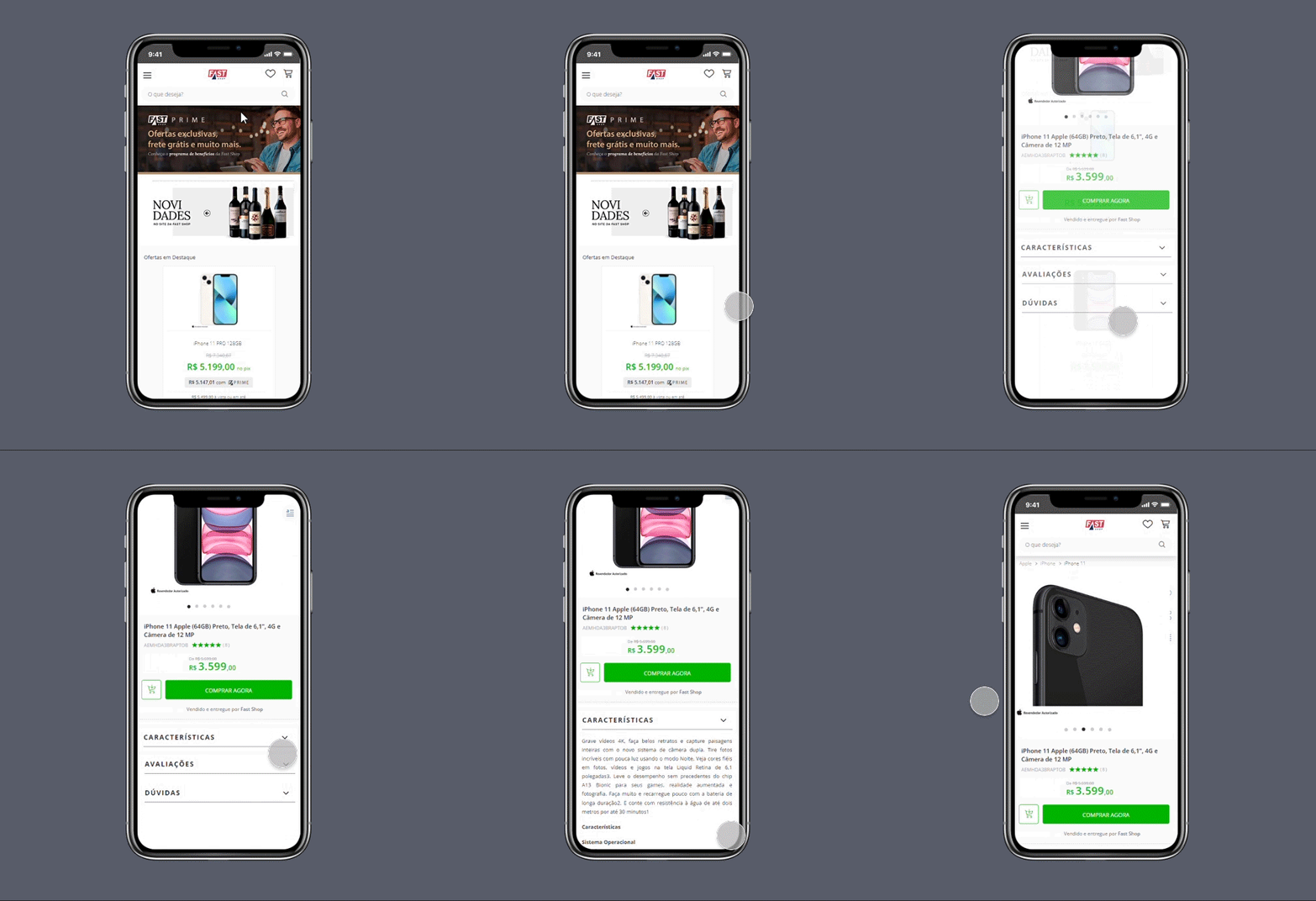
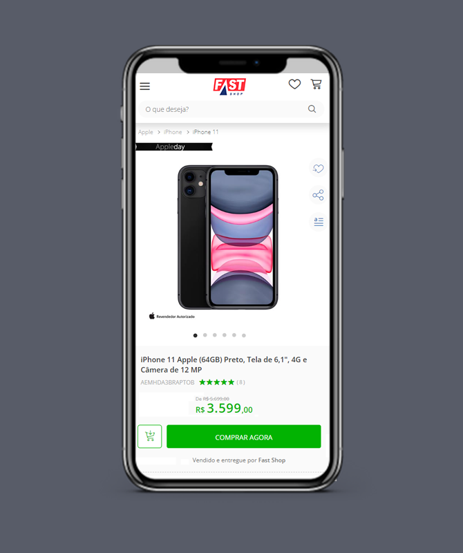
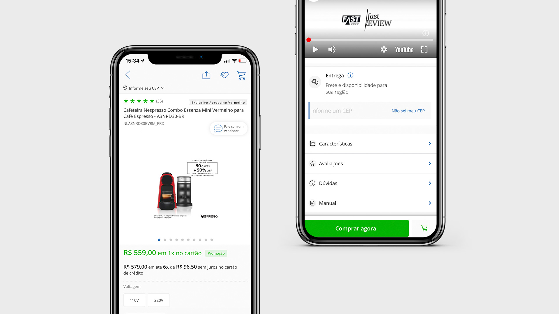
Mobile app, home page and product pages
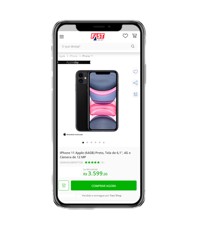
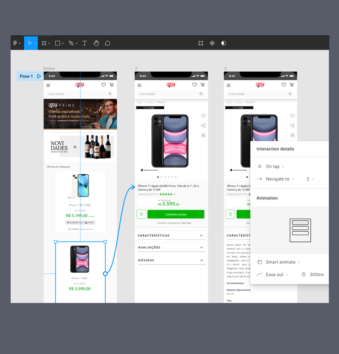
With all the insights from the research and discovery phases, I did final prototypes that have been implemented for both android and iOS.
The prototypes brought the visual evolution, but also simplified aspects of the buying journey. The product pages became more informative, bringing special content about each product, which reduced the bounce rate, since that information was there and kept the user inside the App.
Let´s
work
togheter!
Contacts
Magnocalderon@gmail.com
BR +55 11 97031-5955
IT +39 328 232 0412

