Estadão App Product Design
case study
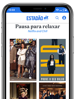
The challenge
How to bring a 150-year-old media company into the digital age?
Estadão is the largest news outlet in Brazil, with real-time worldwide coverage. Adapting this information industry to current formats and languages is the App's main challenge.
Modernizing the way the user consumes the contents of Estadão, improving accessibility and updating the language to attract a younger audience were the main guides for this project. This case study tells the product design trajectory of the Estadão APP, from ideation to the prototype.

Design process
Stages of product development
Immersion
What is it, who is going to use it and how does it work?
To format the product it is important to understand who the users are and what are the benchmarks that can be references for the functionalities.
Co-creation workshop sessions were held with stakeholders to identify personas, benchmarks and define using the Lean inception framework what was the vision of the product and its main functionalities.
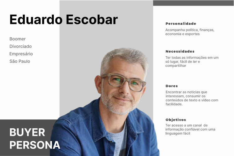
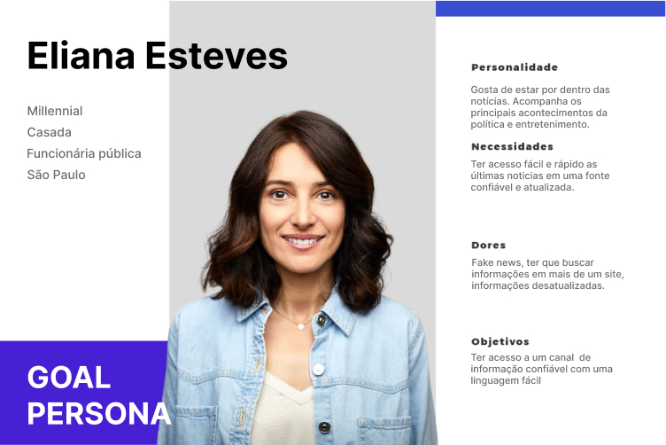
product development
Lean inception results

Discovery
It is - It is not - what it does - what it does not do
After a few sessions with the stakeholders, the main features of the app were defined and especially the things it was and what it should not be. also what it should do in its MVP version and what it would not be possible to implement with the currently available features. In addition to the functionality, it was prioritized which sections should be implemented first.
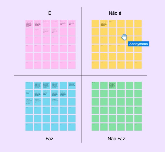
Main
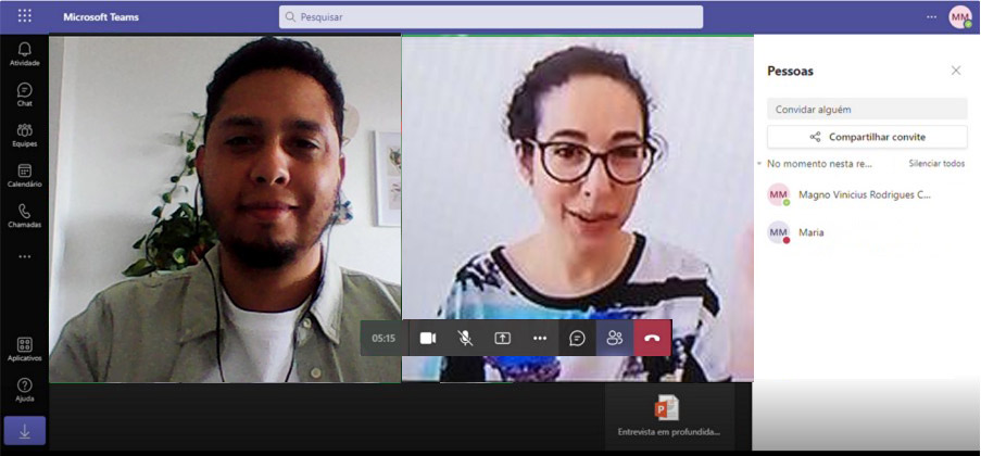
Insights from
Interviews
Solutions
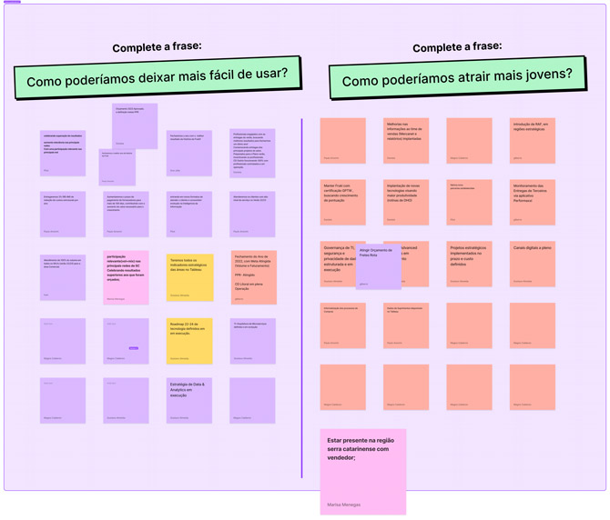
Easy for boomers, attractive for millennials
Having collaborative creation sessions for understanding solutions was really a differential on the product design of this app.
Once I collected the main insights from the interviews with users and stakeholders, I asked the stakeholders the best ways to solve the problems. Many of these solutions cited were the basis for the creation of wireframes and prototypes.
Wireframes
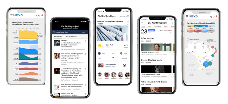
How it should look like (benchmarks)
Prototypes
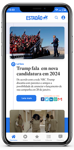
News, columnists, special articles and onboarding
With all the insights from the research and discovery phases, wireframes were created and the benchmarks for the prototypes were defined
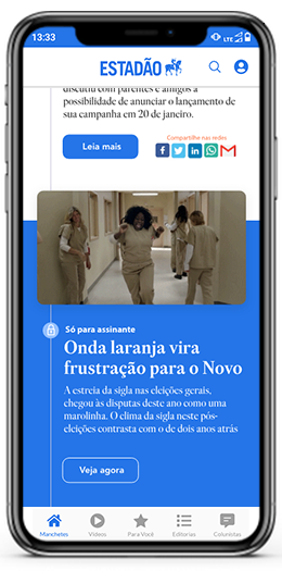
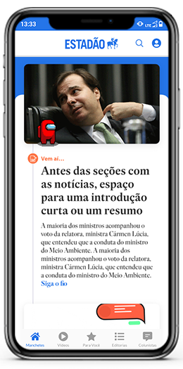
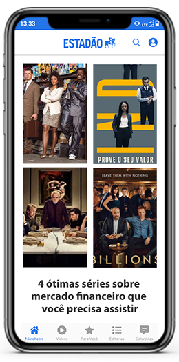
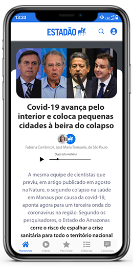
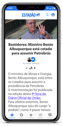
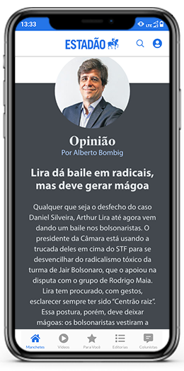
The prototypes brought the visual evolution to the language that would be more attractive to millenialls, with animations and gifs, in addition to a language that is easier to understand and stripped of. For the older public, accessibility solutions were created as the easiest option to increase and decrease the source and the functionality of being able to listen to the news, instead of having to read.
Design System
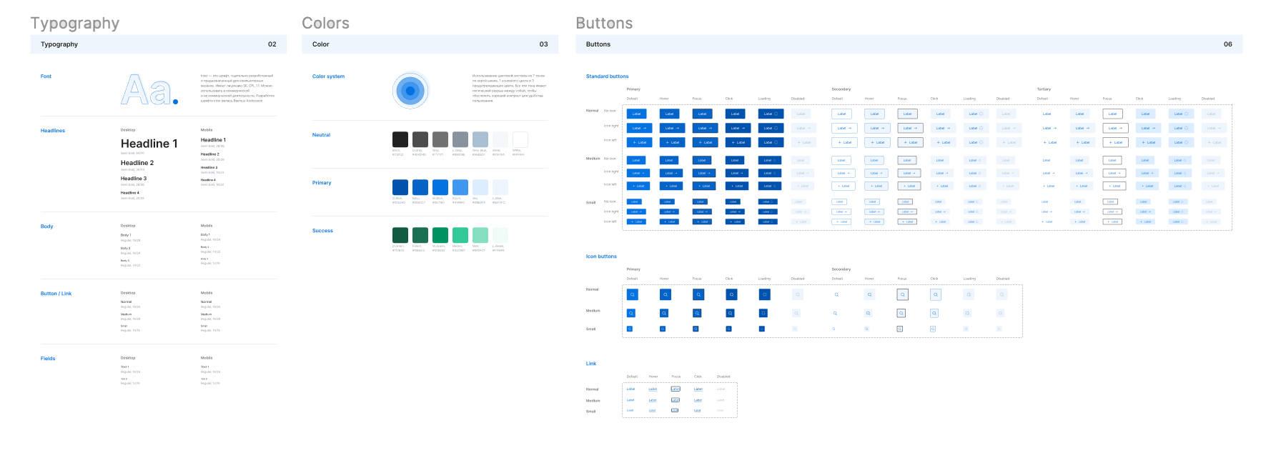
Managing Components
Usability tests
Where can we improve to make it more intuitive?
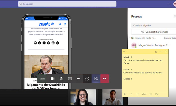
Usability tests can uncover pain points and friction within the app's navigation, layout, or functionality. Understanding these issues enables developers to address them effectively, enhancing the overall user experience.
Usability testing validates whether the app's design decisions resonate with the target audience. It ensures that the design aligns with users' preferences and mental models.
Let´s
work
togheter!
Contacts
Magnocalderon@gmail.com
BR +55 11 97031-5955
IT +39 328 232 0412

